How Color Tokens Were Invented
Before design systems, interfaces relied on hardcoded hex color values scattered across stylesheets and components. While this worked for small projects, it became unmanageable as products scaled. Updating a single brand color could require changing dozens—sometimes hundreds—of instances. Inconsistent usage led to visual drift, where slightly different shades appeared across the product, weakening brand coherence. Accessibility improvements required manual audits, and introducing dark mode often meant duplicating entire color sets rather than adapting existing ones. As design evolved toward systems thinking, teams recognized the need to separate meaning from appearance.
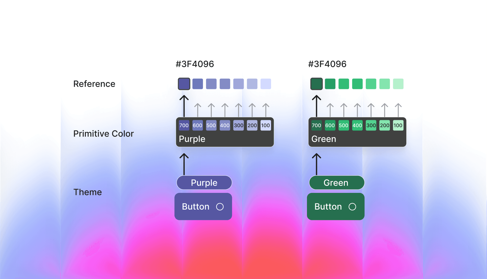
This led to a key breakthrough: prioritizing semantic meaning over raw values. Color tokens emerged from design systems and front-end architecture as a way to map intent to value, allowing teams to define colors by purpose rather than fixed hex codes.
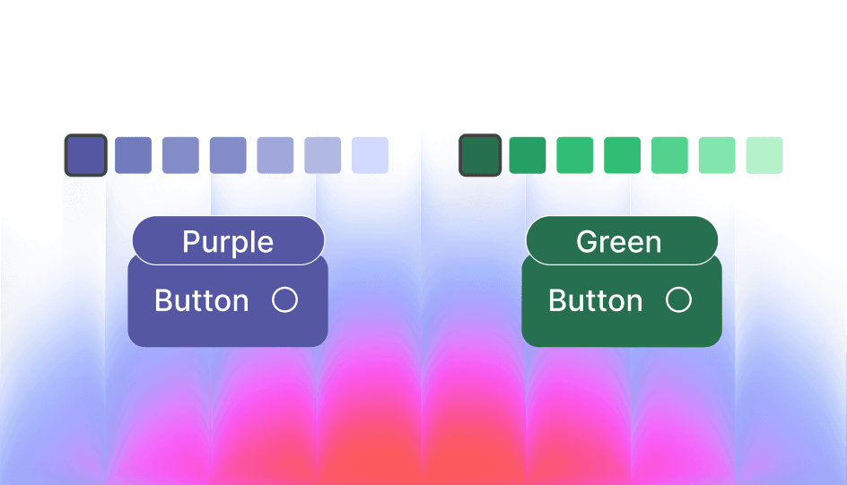
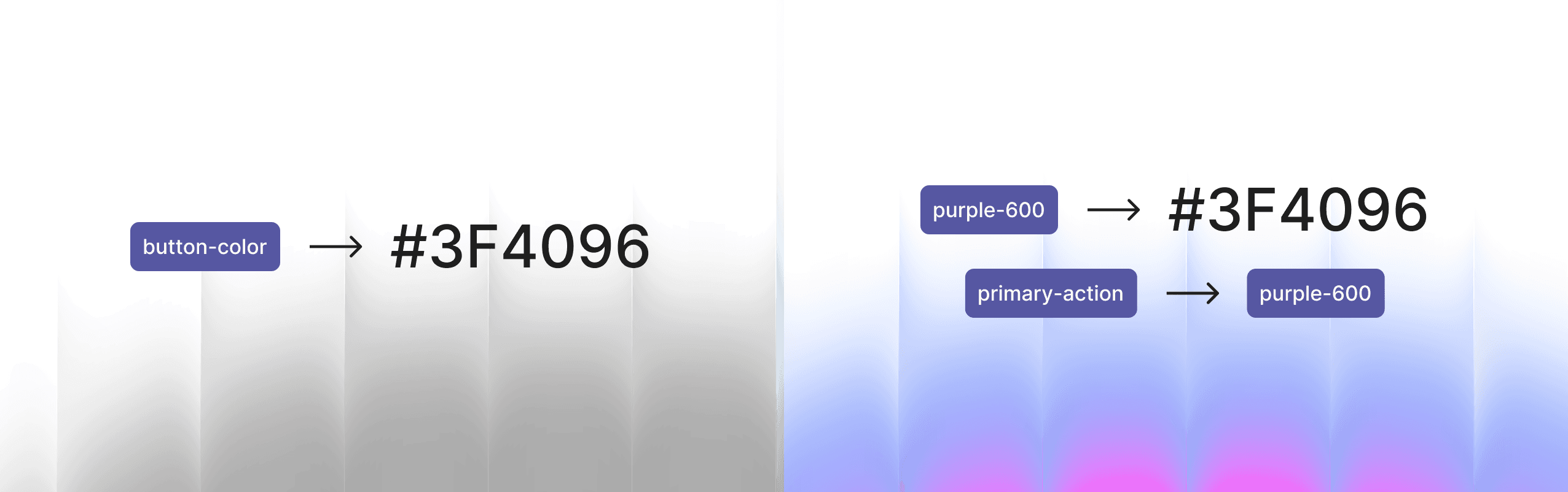
Instead of assigning hex values directly, teams introduced primitive tokens—base colors with simple names (e.g., purple-600). These primitives were mapped to semantic tokens that conveyed meaning, such as action-primary. For example, action-primary → purple-600. If the system later required a change to green, updating the mapping to action-primary → green-600 would instantly update all primary action buttons. This approach created an efficient, scalable system—one that modern design systems continue to follow today.
In the Era of Generative UI, Expressive Design With Color Tokens is the Next Big Thing
We are entering a phase where interfaces are no longer static layouts. Generative UI allows interfaces to be dynamically composed at runtime based on context, adjusting layout, content, interaction patterns, color, and theme according to user preferences, accessibility needs, brand contexts, or AI-driven personalization. Instead of a single fixed interface, designers now create systems capable of producing many valid variations.
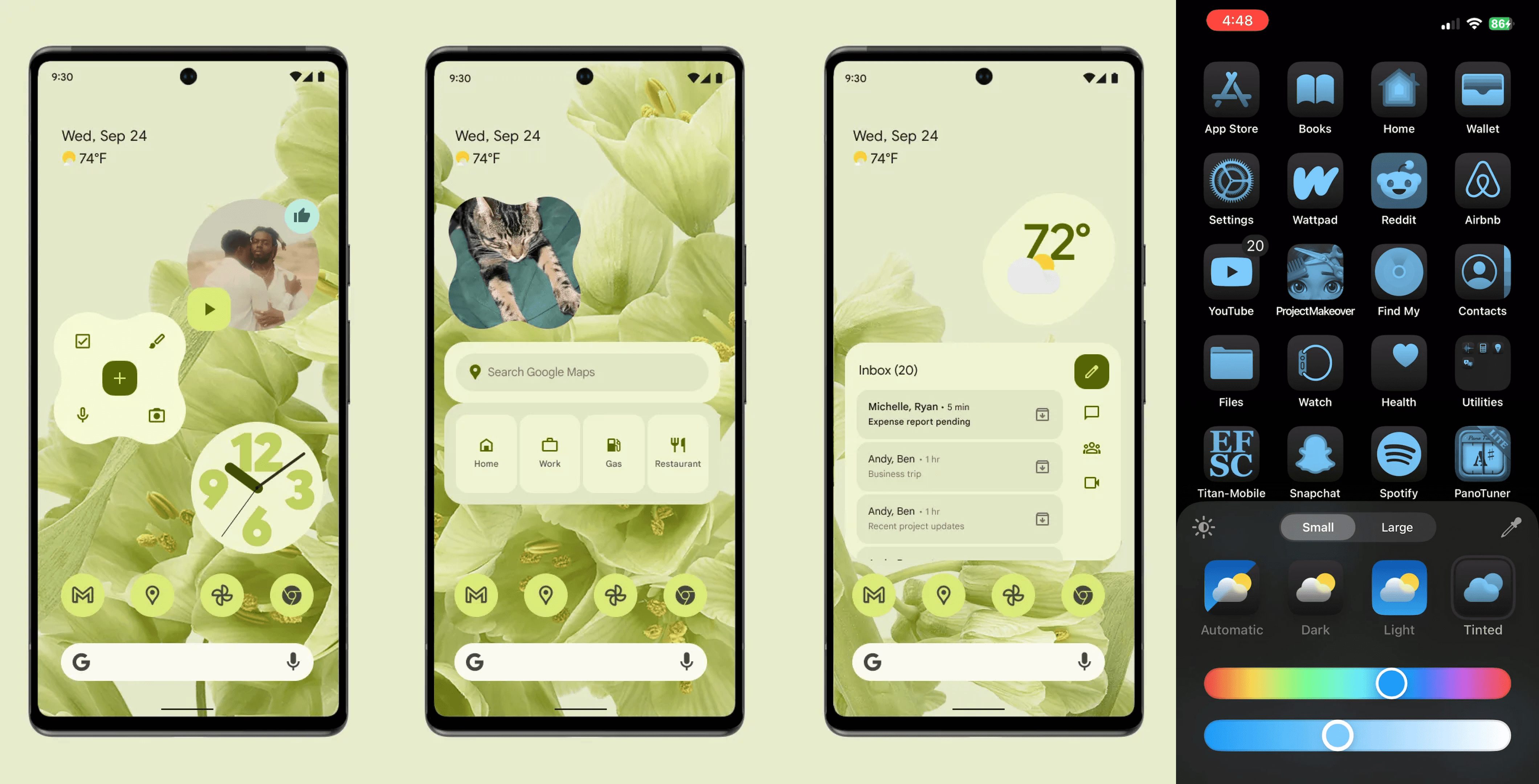
Color tokens are what make this flexibility possible. Without semantic tokens, runtime theming would be fragile and inconsistent. With tokens, users can switch to high-contrast mode, products can adapt to brand white-labeling (shown in video below), AI can safely generate new themes, and interfaces can respond to environmental contexts such as low light. Tokens act as control points for dynamic expression, separating meaning from visual representation.
Originally coined by Google, “expressive design” referred to the idea that your device should reflect your personality, inspiring their latest design system, Material You. The system adapts to the colors you choose extracting a palette from your wallpaper and generating a harmonious range of shades. This palette is then applied across the interface, from dark backgrounds to bright primary buttons, ensuring that all UI elements feel cohesive and personalized. Apple later adopted a similar approach, but few other companies have implemented it at this level. In contrast, many SaaS products achieve customization by applying a single brand color per client rather than dynamically generating a full palette.
How to Do it in Figma
Figma now supports token-based workflows that mirror how modern design systems manage color. The process begins by defining primitive colors, which serve as base values with clear, descriptive names like Blue / 600 or Red / 500. These primitives are then mapped to semantic tokens that carry meaning within the interface, such as Action / Primary or Text / Primary. Designers apply these semantic tokens directly to components buttons, text, alerts ensuring consistency and reducing the risk of visual drift. Tokens also enable theming: by creating modes such as light, dark, high-contrast, or brand-specific variants, designers can update primitives while components automatically reflect the new palette. This approach not only maintains visual consistency but also supports accessibility, scalability, and future adaptability, making Figma an effective environment for building flexible, production-ready design systems.
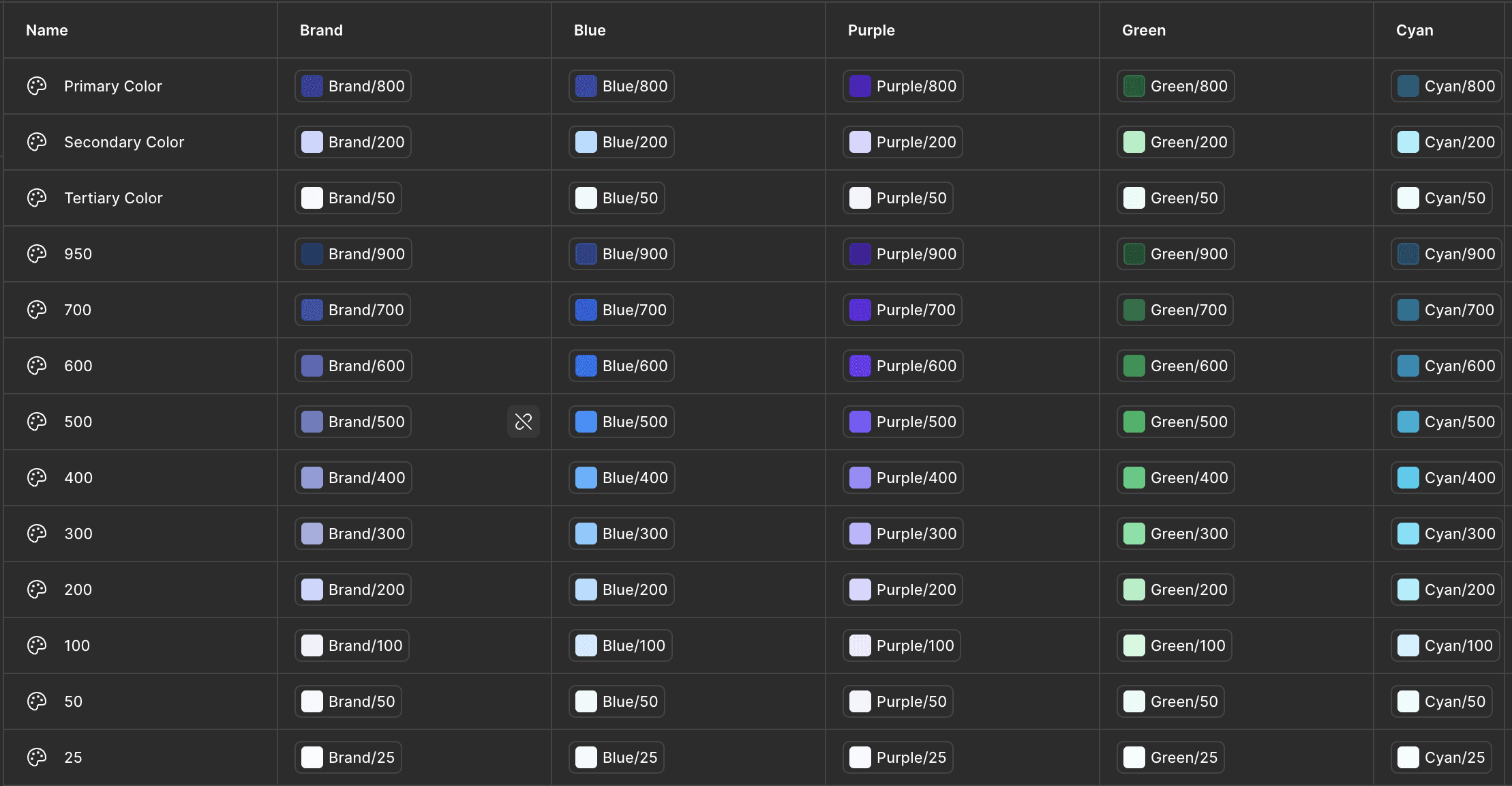
For a brand-themed setup, create a set of primitive values for each brand shade you want to support. Here’s a snapshot of how your variables should be structured.
Once that’s done, design using only these variables for elements that need to adapt to different themes. For example, apply the variables to primary buttons so they change with the theme. That’s it your design will now adapt automatically. You can test it by switching appearance modes in the right panel.
Make AI Dance on Your Rules
Why does this matter? As designers working in Figma, we could have manually applied all of this quickly but that’s not the point. What really matters are the rules you set in your mind: which areas need brand theme assignments, which don’t, and what range of colors is needed. AI is not smart on its own generated UIs won’t behave the way you want unless you define these rules first. By setting these guidelines, you ensure that AI-generated UI follows your intentions. Essentially, it’s about introducing systems thinking into our workflow to handle the new patterns of interfaces that are coming.
Thanks For Reading 🙌
Other Blogs
Design Systems in The Age of AI

Getting off the Talking Stage With My Tools

Designing Beyond the Screen