Overview
An Effective Solution to Reduces Driver Distraction
The Team
Contributions
UX Testing
UX Design
Prototyping
Time Line
27 January, 2025
to
24 May, 2025
Results
What Difference Did We Make?
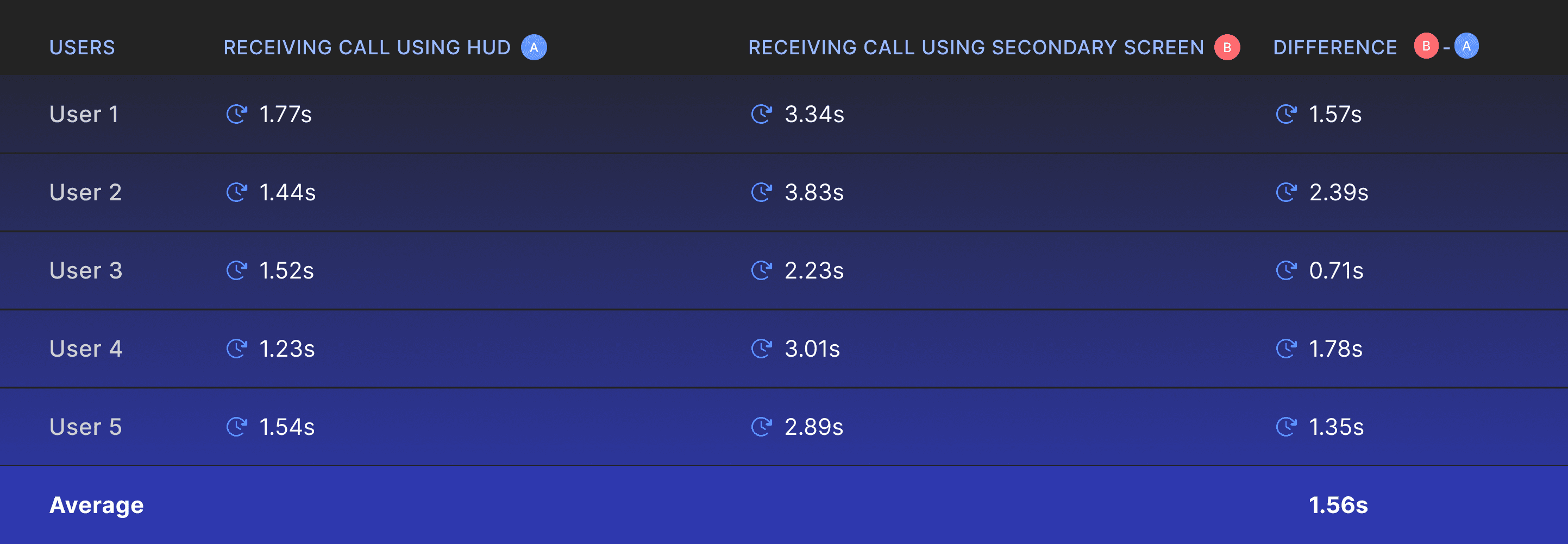
1.56s
Using the HUD led to a 1.56-second decrease in dwell time. “Dwell time” refers to the total duration a driver’s attention is diverted from the road to perform a specific action, in this case, answering a call.
80%
The user satisfaction score of 80% was achieved from qualitative testing, where participants agreed that the HUD would greatly enhance their driving experience and reduce distractions.
Research
Understanding Driver Needs
We interviewed 5 experienced US drivers (3–5+ years) to explore their expectations and behaviors related to Heads-Up Displays (HUDs). Using affinity mapping, we analyzed preferences, customization habits, and concerns, focusing on diverse driving contexts and derived the following insights
Clarity Over Clutter
People prefer having navigation and speed information upfront. But they do not want to compromise on the minimalism of the HUD interface and express concerns about cluttering.
Varying Priorities
We also noticed that users have varying preferences regarding what they consider important. For instance, one individual prioritized RPM and wanted it displayed in the HUD, while others did not share this preference.
Fear of Distraction
Most drivers found music control and phone alerts distracting, often leaving music handling to co-passengers and minimizing its importance while driving.
A Confusion Between Features & Aesthtics
We performed a heuristic evaluation across competing products, introducing a more structured approach to competitive analysis. By applying defined heuristics, we were able to extract focused insights into the current landscape of HUD technology and uncover existing gaps. Additionally, we developed two custom heuristics tailored to the automotive and HUD context: one measuring feature richness and the other assessing the level of customization offered.

Design Strategy
Using Design to Bring Balance
The identified user needs and existing gaps were addressed by striking a balance between functionality and Simplicity. Minimalism was achieved through thoughtful element placement, smooth transitions, and deliberate design choices. Strategic design decisions enabled the integration of additional features without inducing complexity and anxiety for users.
Positioning
A study suggests that critical information in a HUD should be placed within 5–15 degrees of the driver’s line of sight to allow quick and easy access. Elements that might raise concerns about distraction should be positioned outside this range. Still, placing such content in the HUD is preferable to showing it on secondary screens, as it results in less distraction.

Based on this, we placed primary data, like speed, RPM, navigation, fuel, and engine temperature, within the optimal viewing zone. Meanwhile, content that appears without user initiation was kept outside this range, ensuring drivers only notice it when they choose to engage. This approach effectively addressed users’ primary concern: fear of distraction.
Visual Design Techniques
Adding more features often caused issues with readability and visibility. This is one reason why many competitors chose simpler versions unless they found a way to overcome these challenges. We addressed this through practical design strategies. We understood that popular AR design techniques like background blur and text vibrancy would not work for HUDs because they rely on projection, which behaves differently than standard digital displays. Instead, we applied effective solutions such as contrast shadows and a car-specific typeface called Scandium. These choices improved readability and visibility while helping us maintain a minimal design.

Adaptive UI
The design was sensitive to changes in environmental lighting, not just the difference between day and night, but the overall brightness of the surroundings. To ensure optimal visibility, we created adaptive design variants that respond to lighting conditions. These versions adjust contrast, shadow hues, and modify color brightness and saturation to maintain clarity in any environment.
Transitions
Users were particularly concerned about distractions from incoming calls or music info on the HUD. To mitigate this, we implemented smooth transitions paired with audio cues that subtly signaled upcoming events. This approach helped users anticipate system behavior, minimized unexpected interruptions, and empowered them to maintain control over their attention.
User Testing
ClearPath on A Test Drive

The most challenging aspect of the project was UX testing. One major hurdle was creating a realistic driving environment to evaluate our design effectively. We achieved this through a sophisticated prototyping setup using the Wizard of Oz method, where users experienced four key driving scenarios: navigating a complex highway exit using HUD-based navigation, utilising ADAS data to change lanes and detect nearby vehicles, and interacting with incoming calls and media through the HUD. While users simulated driving during the test, I controlled the prototype behind the scenes, adjusting it in real-time based on each specific scenario.
The prototype incorporated not just visual driving simulations but also audio cues, which were essential to the overall user experience. These cues were synchronised with transitions and the information displayed on the HUD to closely mimic real-world conditions.
4 Scenarios
Scenario 1 : Navigating Multilanes & Exits
In this scenario, the driver is asked to take an upcoming exit on a highway. The goal is to take the first exit by following the navigation cues and audio feedback. Our team evaluated the usefulness of the navigation information.
Breakthrough Results
“Yes, this causes much fewer distractions than the way I usually handle calls.”
"Seeing my playlist here is clearly more efficient and makes it easy for me to change music"
Apart from qualitative affirmation from the users we tested with, we also compared the dwell time involved in attending calls using the designed HUD versus using the secondary screen (the infotainment display to the right of the driver). This dwell time represents the total duration a driver is distracted from driving, including the time taken to shift gaze to the target, the fixation time on the target, and the time needed to refocus on driving.
In addition to minimising distractions, we also addressed drivers’ concerns about information overload on the HUD. The test results demonstrated that the HUD was not only effective in significantly reducing distractions but also achieved this in a user-friendly manner.
None of the content obstructed or interfered with the driver’s line of sight for any user.
Automatically appearing information did not catch any user off guard, and the subtle transitions helped.
Also, some aspects didn’t work as expected initially, but they were resolved in the final iterations.
Users expressed a desire for a more detailed version of the navigation system with broader map coverage.
Users had varying preferences for the HUD display—while some felt features like RPM were unnecessary, others considered them important. The same divided opinions were seen for music information.
Iterations
Creating a Solution That Works for All
New Layout
To accommodate a larger map view, we implemented a 3D perspective map system. Additionally, a new layout was introduced to enhance the readability of key components such as speed and RPM. Overall, the design improvements were aimed at making the interface more readable and user-friendly.
Modular Design
Through user testing, we discovered that individual preferences varied significantly. Our visit to the NY Auto Show 2024 reinforced this insight, as we observed a wide range of dashboard styles. Some vehicles retained traditional dials, while others embraced more modern designs. Unlike fixed hardware in cars, which limits customization, a HUD system powered by software offers the flexibility to adapt. To support this adaptability, we designed each component as a modular widget that can be customized or removed. The system dynamically adjusts to these changes within a set of rules and guidelines, resulting in a flexible and user-centred experience.
Interactive Prototyping

Rive Community
Top Rive Animation
I created the final prototype in Rive, using data binding to connect dynamic elements like speed and RPM to variables, enabling real-time updates. This prototype features a startup animation that appears when the car is turned on. What’s exciting is that this animation can be deployed in a real vehicle right away!
Retrospective
Designing Our Way Through Problems


Users are Good at Pretending
During testing, one surprising insight was how naturally users pretended the experience was real, and the results turned out more accurate than expected. Although the setup was designed to simulate a real scenario, we assumed users wouldn’t fully feel immersed. But when asked to pretend, they did it effortlessly. Next time you test, don’t hesitate to encourage users to role-play, as it can lead to more realistic feedback.
Be Hard on Yourself When Testing
We crafted the scenarios to push every part of our design to its limits, using varied lighting conditions and challenging driving situations. The goal was to design tests that were likely to fail. But when everything actually worked, the satisfaction was unmatched. It’s the kind of moment every designer hopes for, and if it doesn’t happen in the first round, it’s definitely worth striving for in the second.
Don't Be Afraid of Tools
It’s not the tools that make us great designers, but they open up new possibilities that help us stand out. This project wouldn’t have been the same without the curiosity and drive to explore advanced prototyping using Figma and Rive.